React Component Library comparison · 2026
shadcn/ui vs Radix
Radix UI is a set of unstyled, accessible React primitives — the behaviour and ARIA handling, none of the looks. shadcn/ui builds on top of Radix: styled, Tailwind-based components you copy into your own codebase and own outright.

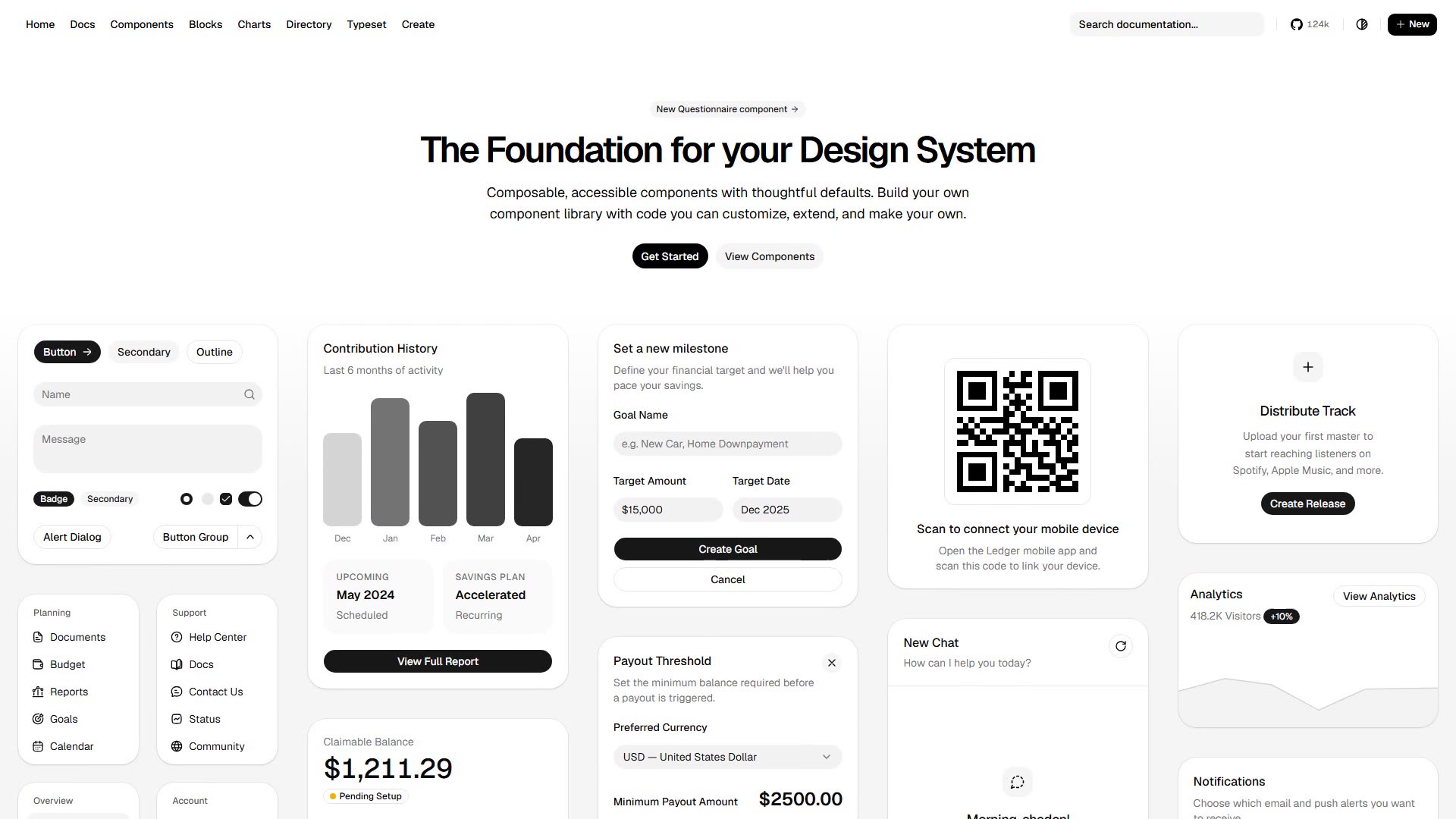
UI components you copy directly into your own codebase instead of installing them as a package.
- Category
- React UI component libraries
- Website
- ui.shadcn.com
- Tags
- shadcn


Accessible, unstyled UI primitives you can style freely when building React interfaces.
- Category
- React UI component libraries
- Website
- radix-ui.com
- Tags
- ReactAccessible
shadcn/ui vs Radix: which should you pick?
Choose Radix when you want full control of styling and just need bulletproof accessible behaviour underneath. Choose shadcn/ui when you'd rather start from good-looking, ready-made components you can still edit freely — it's often how teams consume Radix in the first place.
For reference, on Designeer shadcn/ui is also tagged shadcn; Radix is also tagged react and accessible. Tags come from each tool’s own description, not a scored benchmark.